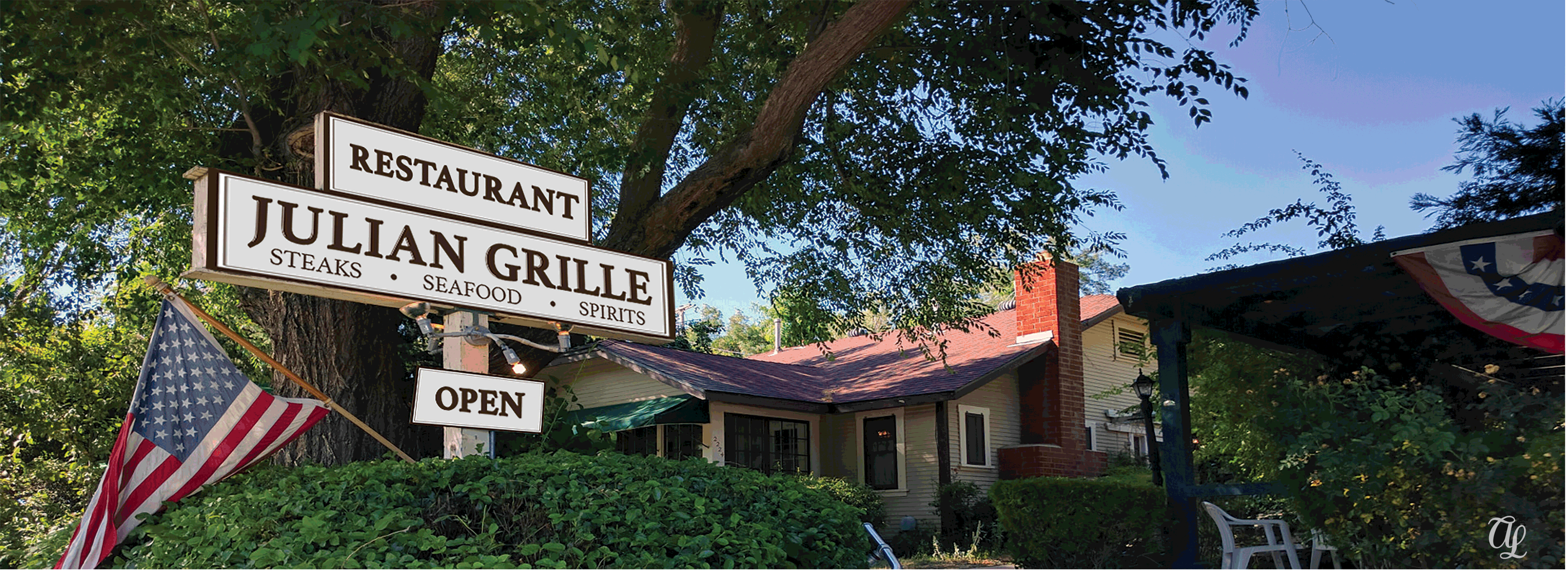
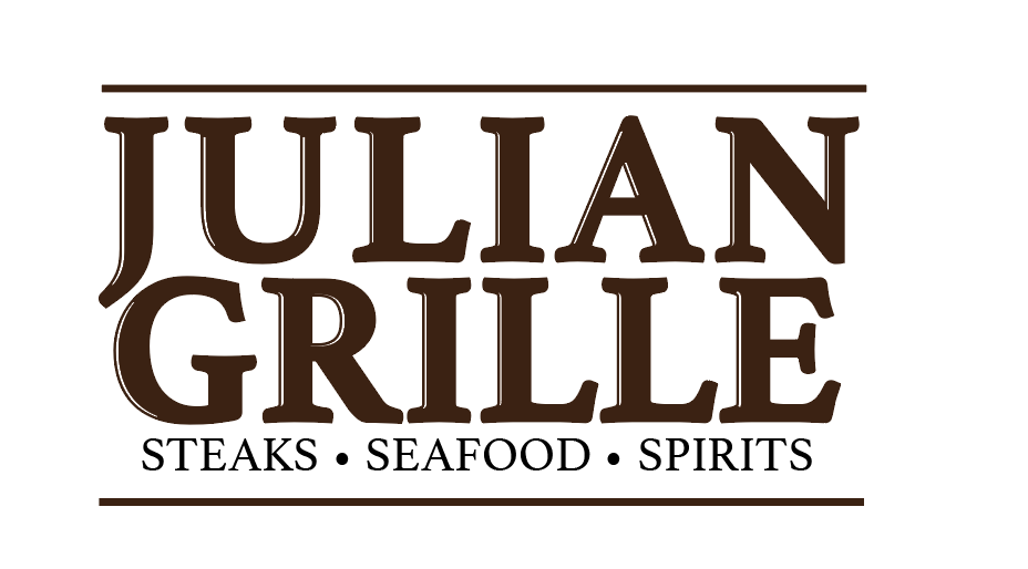
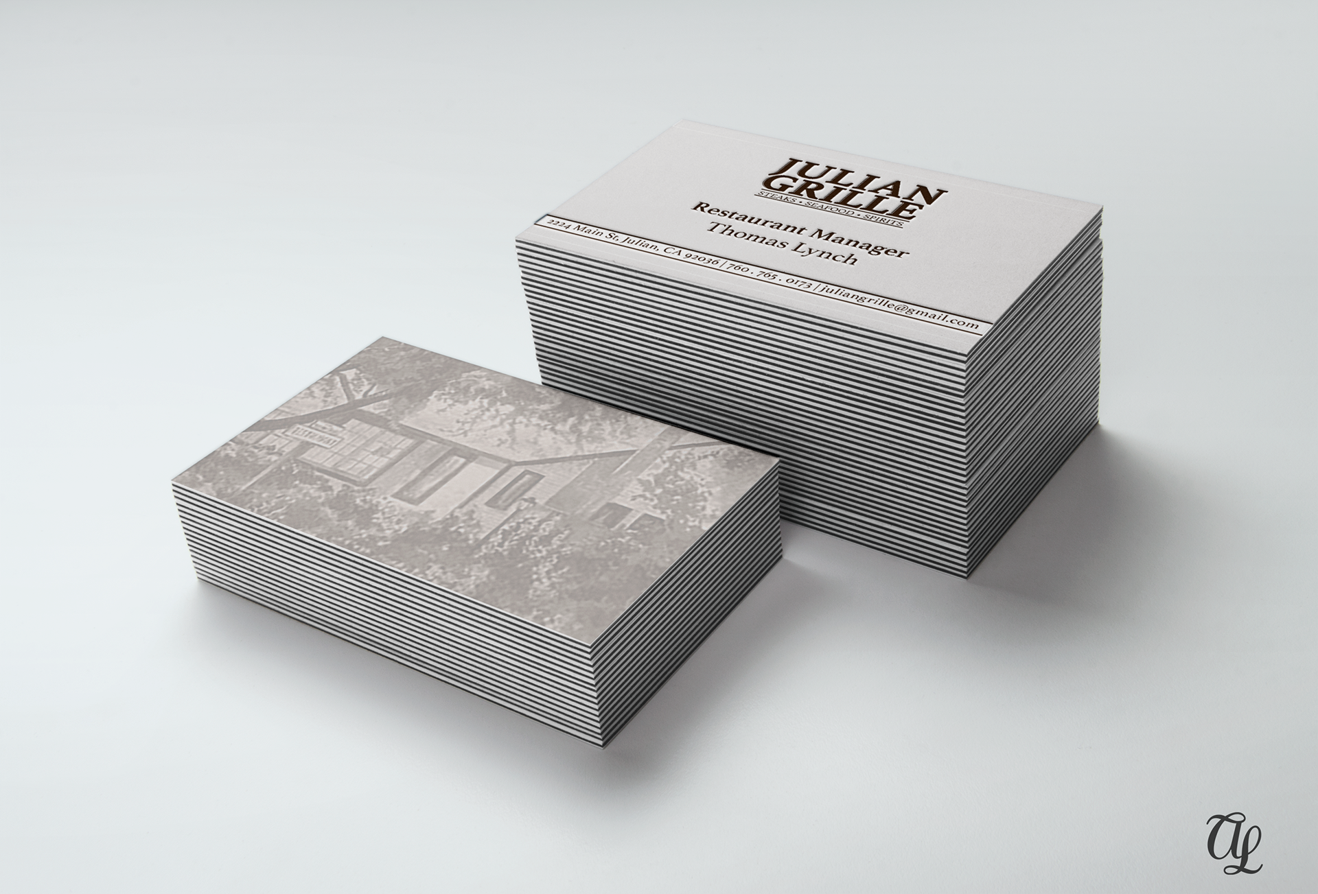
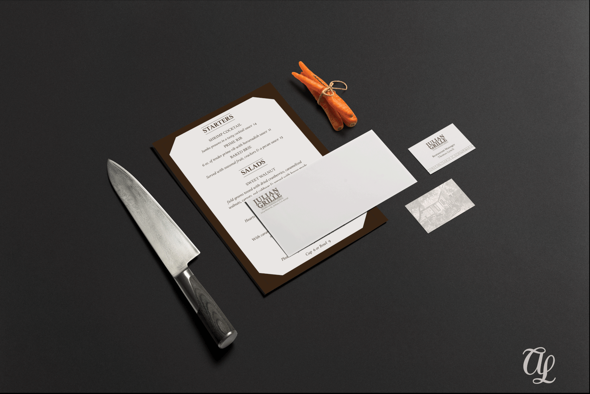
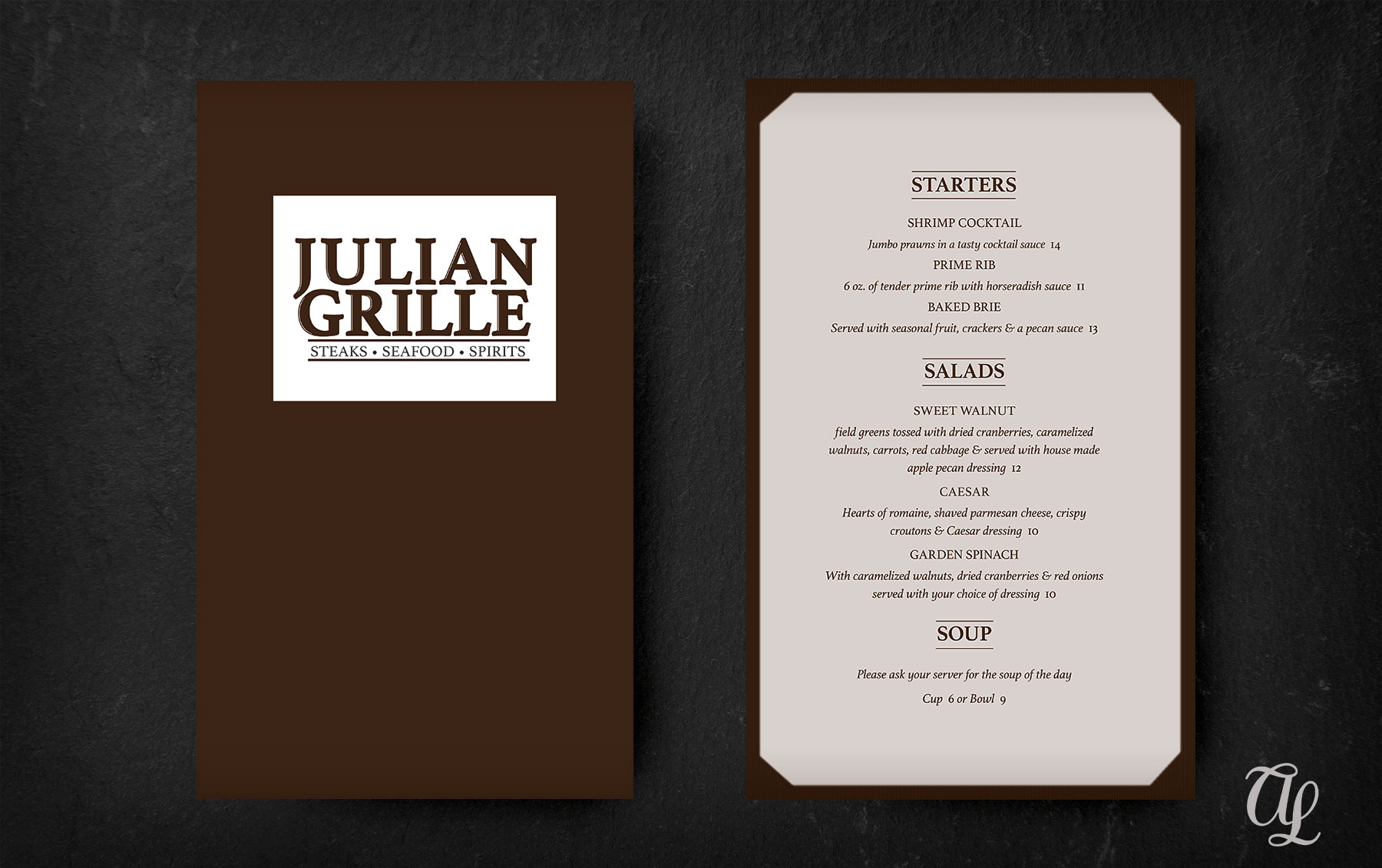
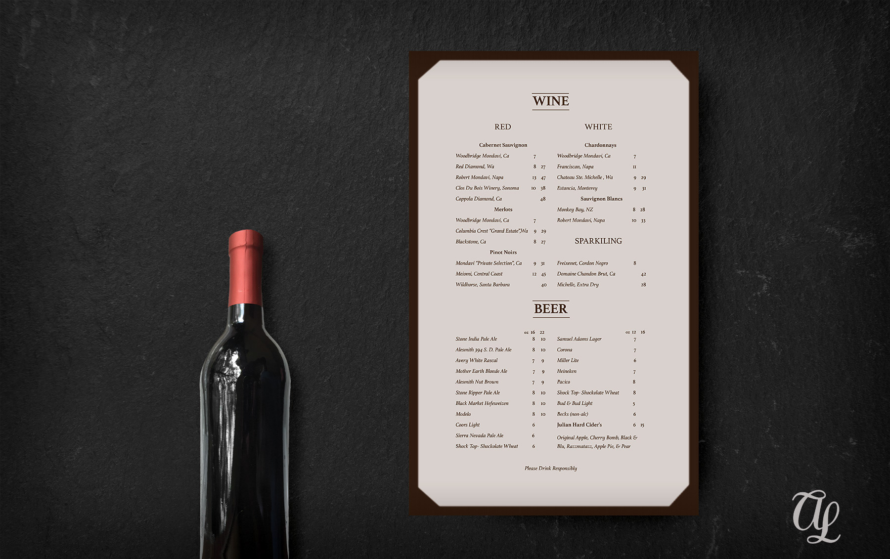
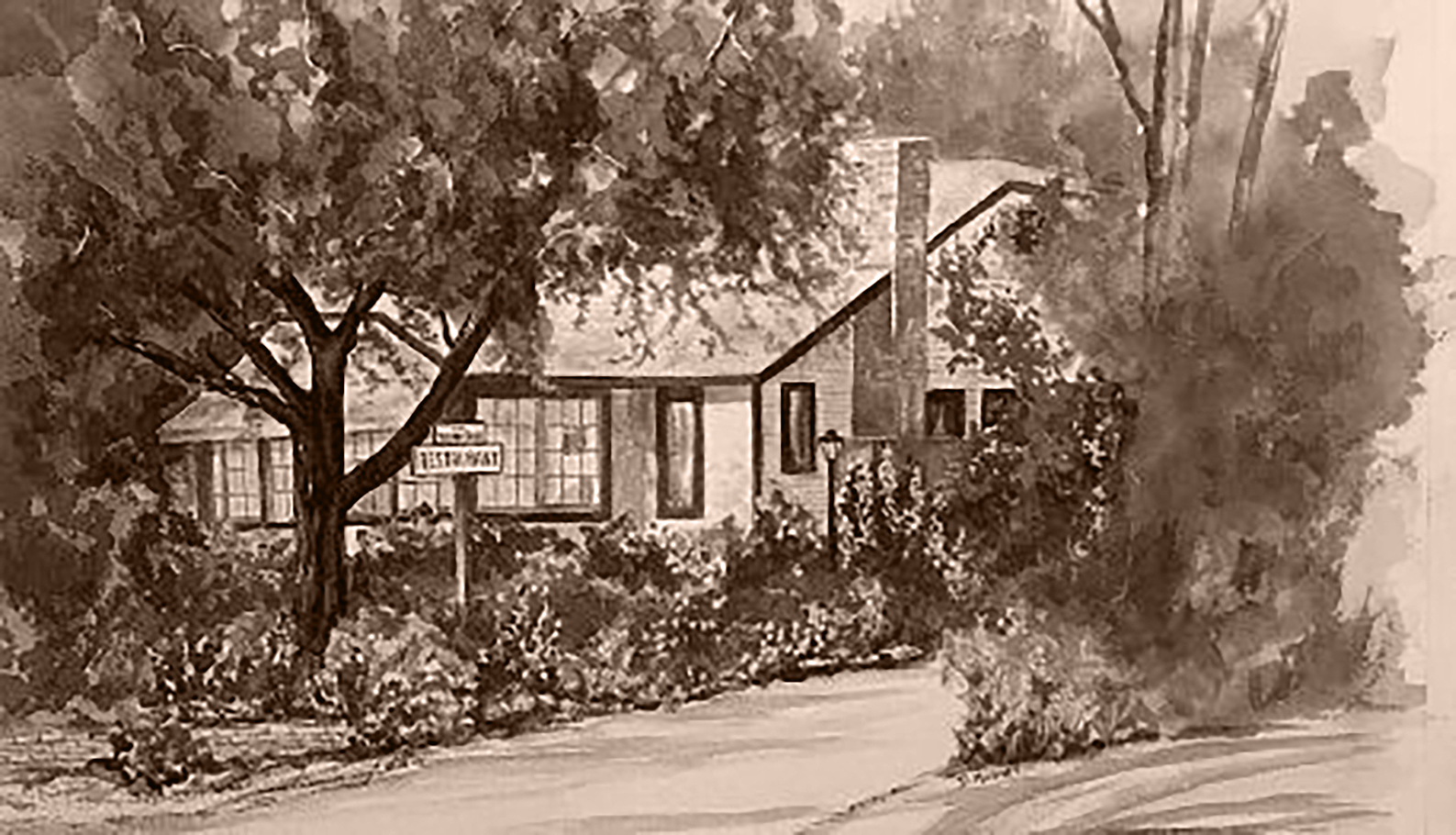
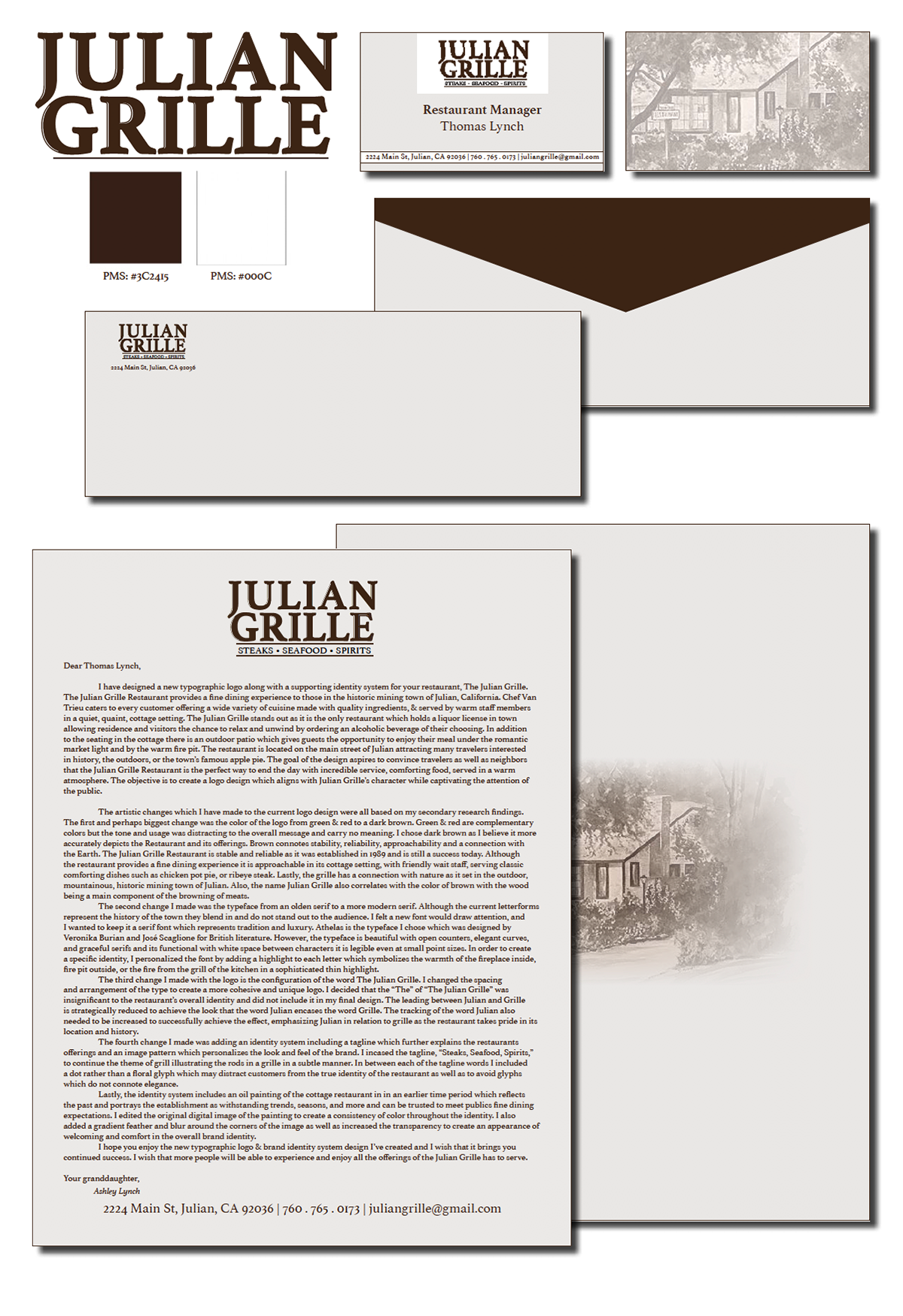

I had the opportunity to rebrand and create a new corporate identity for The Julian Grille Restaurant. The graphic design project was important to me as my grandpa is the owner, I am friends with the chef and staff, and I wanted my designs to accurately depict the restaurants fine dining experience it provides in the small, historic town of Julian. GOAL Designed a new typographic logo and brand identity system for The Julian Grille Restaurant. The Julian Grille Restaurant provides a fine dining experience to those in the historic mining town of Julian, California. Chef Van Trieu caters to every customer offering a wide variety of cuisine made with quality ingredients and served by warm staff members in a quiet, quaint, cottage setting. The restaurant is located on the main street of Julian attracting many travelers interested in history, the outdoors or the town’s famous apple pie. OBJECTIVE To persuade the public that the Julian Grille Restaurant is the perfect way to end the day with incredible service, comforting food, served in a warm and inviting atmosphere. The design should align with Julian Grille’s character while captivating the public attention and influencing them to dine at The Julian Grille. STRATEGY Changed the color of the logo from green and red to a dark chestnut brown. Green & red are complementary colors however the tone and usage distracts from the overall message. Dark brown is a more accurate depiction of the restaurant history, the cottage atmosphere and ties in with the grille theme. The color brown connotes stability, reliability, approachability and a connection with the Earth. Selected a more modern serif typeface. The current letterforms represent the history of the town but blend in with its surroundings. A new font would assist in drawing the public’s attention to the restaurant. Serifs symbolize tradition and luxury. Athelas is the typeface I chose, designed by Veronika Burian and José Scaglione. The typeface is beautiful with open counters, elegant curves and graceful serifs as well as functional with large x-height. In order to create a unique identity, I personalized the font by adding a highlight to each letter repetitive of the warmth of the fireplace inside, fire pit outside, or the fire from the grill of the kitchen in a sophisticated thin highlight. Configured the Logo to increase the audience's understanding of The Julian Grille. This change included adjusting the spacing ad rearranging the type to create a more cohesive and identifiable logo. The “The” of “The Julian Grille” was insignificant to the restaurant’s overall identity and I did not include the word in my final design. I reduced the leading between Julian and Grille to achieve a design that looked like the word Julian encases the word Grille. Additionally, I increase the tracking of the word Julian to successfully emphasize Julian in relation to grille as the restaurant takes pride in its location and history as well as being the only fine dining restaurant in relation to its competitors that is on the main street of Julian. Created a correlating identity system which includes a tagline further explaining the restaurants offerings in addition to an image pattern which personalizes the look and feel of the brand. I outlined the tagline, “Steaks, Seafood, Spirits,” to continue the theme of grill illustrating the rods in a grille in a subtle manner. In between each word of the tagline I included a midline point rather than the floral glyphs which distract the customers from clearly reading the restaurants’ tagline. TOOLS Adobe Illustrator Adobe Indesign Adobe Photoshop